Translated from Portuguese using translation tool
Synthesis
This work is part of the Business Plan of the startup Kantan, accelerated in AmazonasCap's Anhembi Up program in 2019, which development was managed by me. This exposed work shows the fraction of the work only within the UX sphere. The work was done by me and reviewed by Joana Oliveira.
This startup in on standby for now.
Overview
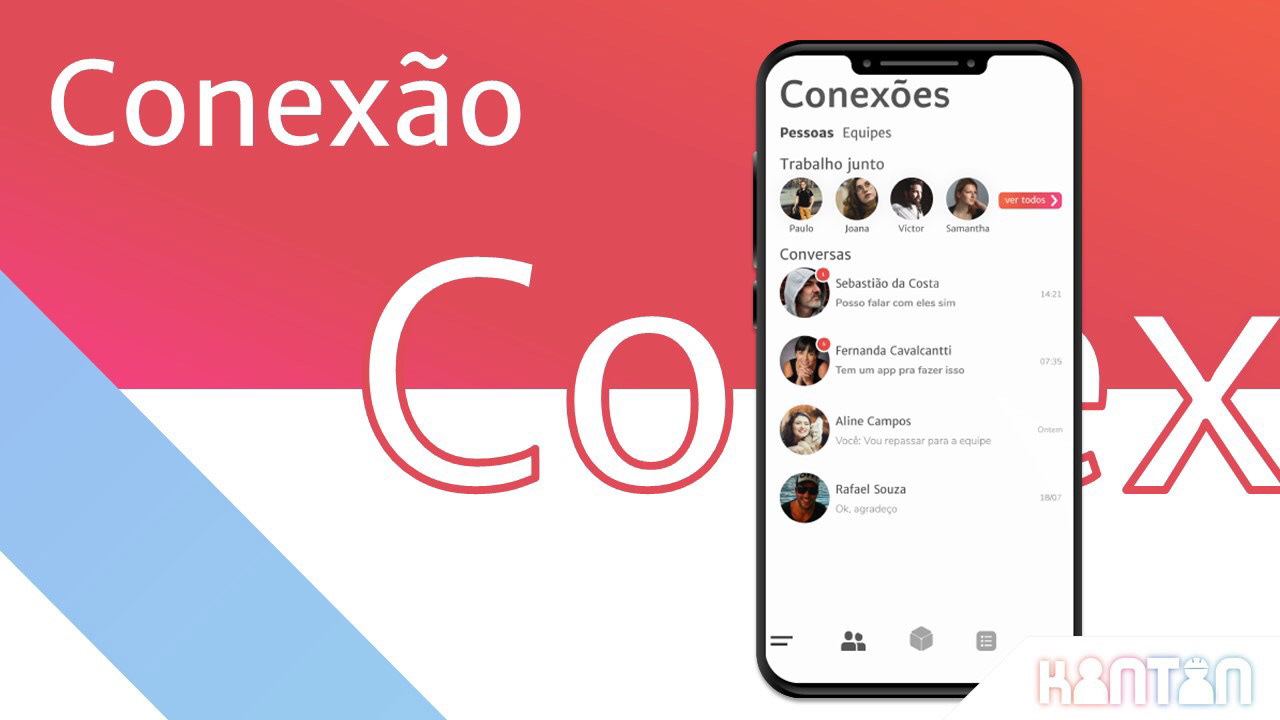
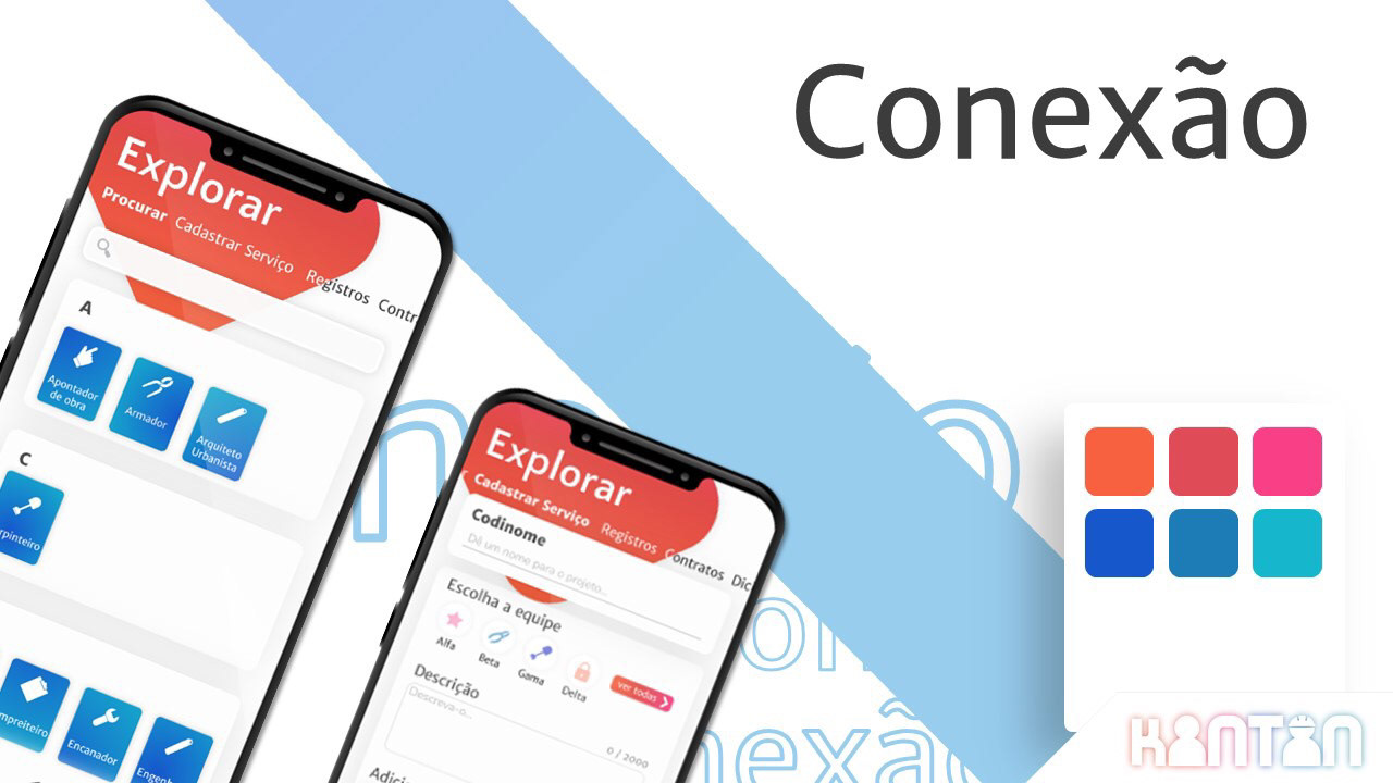
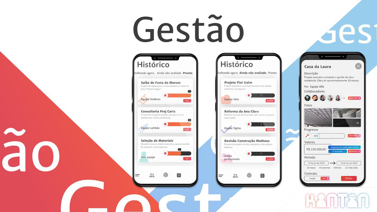
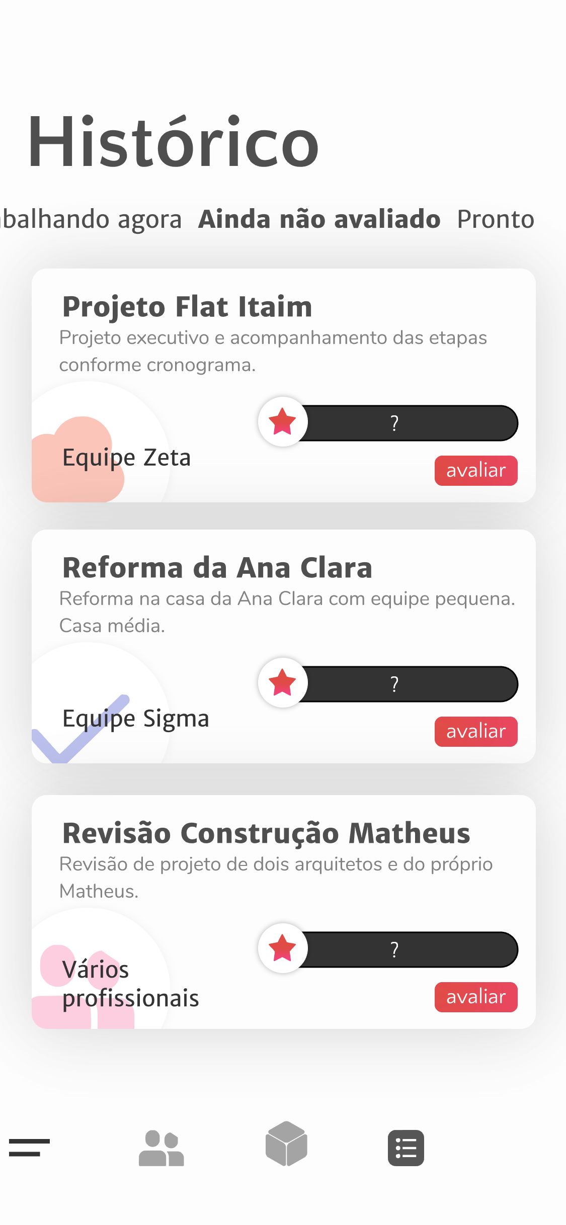
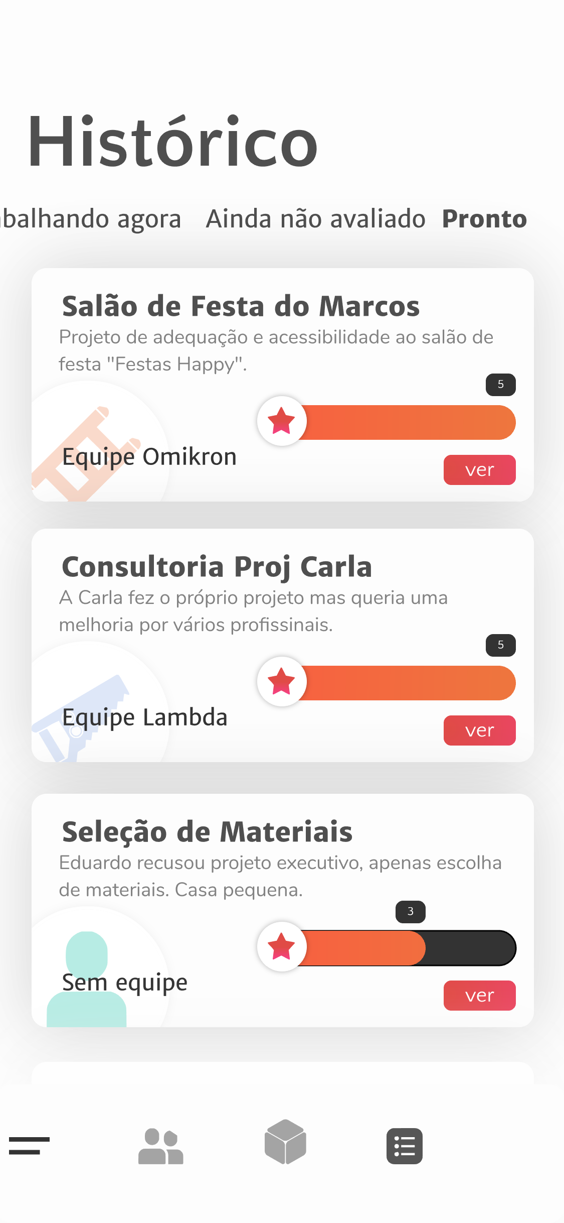
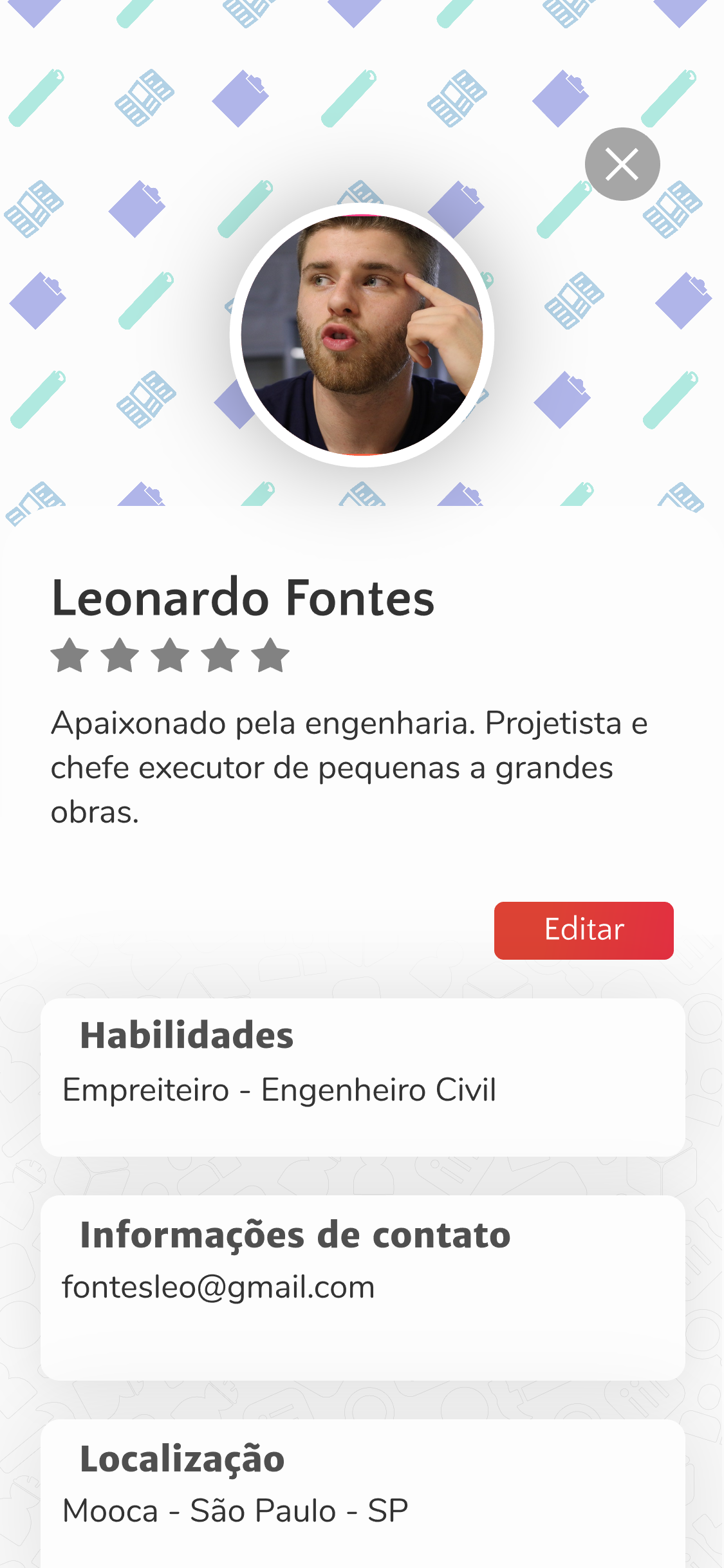
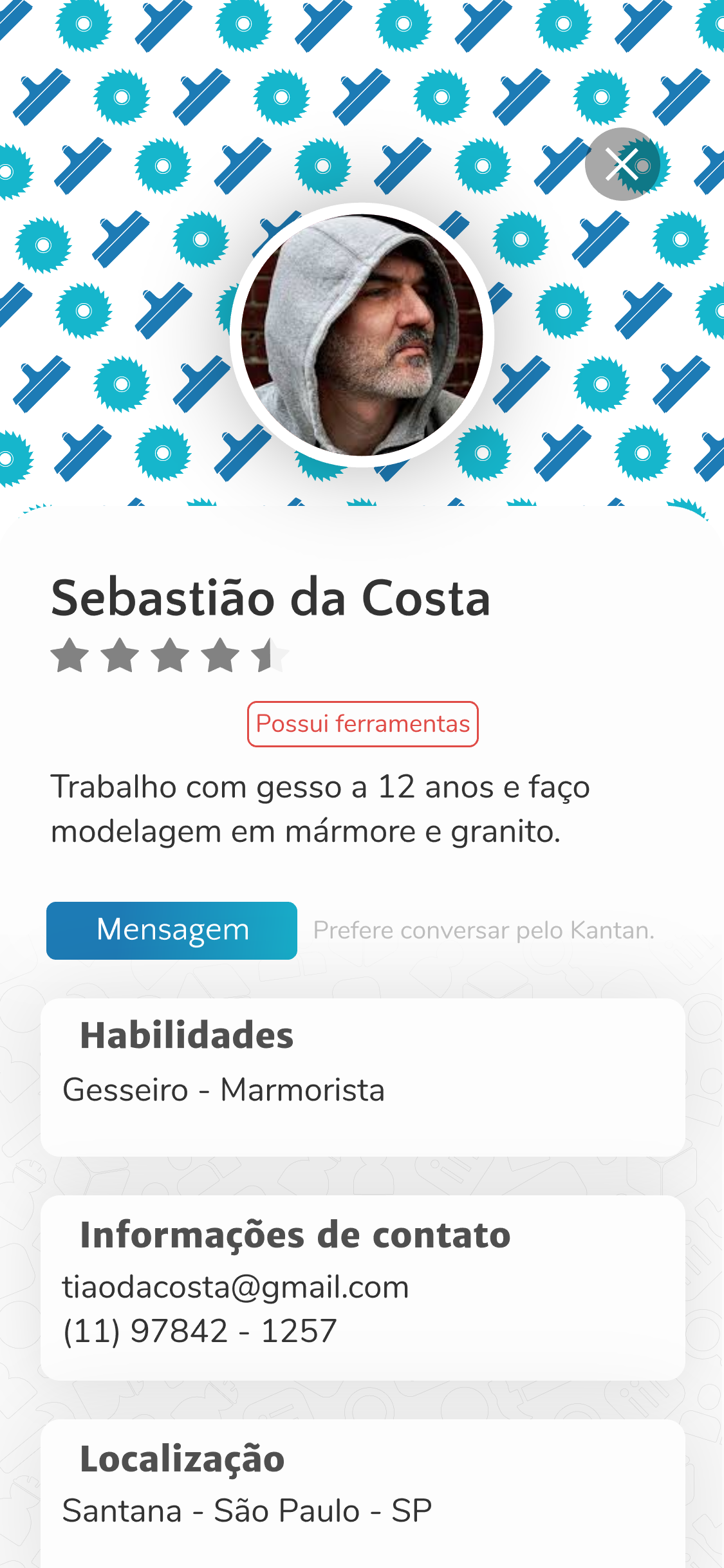
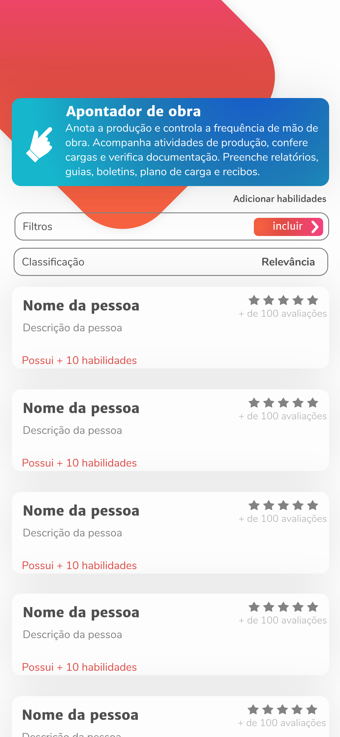
The Kantan application aims to include construction professionals in the digital market to provide a management tool to professionalize the individual management of works, and improve the process of hiring and dissemination of services in this industry. Thus, the need was verified for a simple and objective platform that would allow the inclusion of people with different levels of knowledge about technology, the disclosure of work through a profile in portfolio format, and the hiring of these professionals by other professionals who need a team.The platform is laid out in the format of an application for connection between professionals, which they can download, connect with each other, and manage through it. The contracting client uses a third party platform to find the professionals, this platform is based on Kantan and works on the whitelabel business model.
Extensive UX work was necessary for the inclusion of an audience lacking technological knowledge, for this interviews, tests, prototyping and other methods of surveying and user knowledge were used.
Brand
Positioning
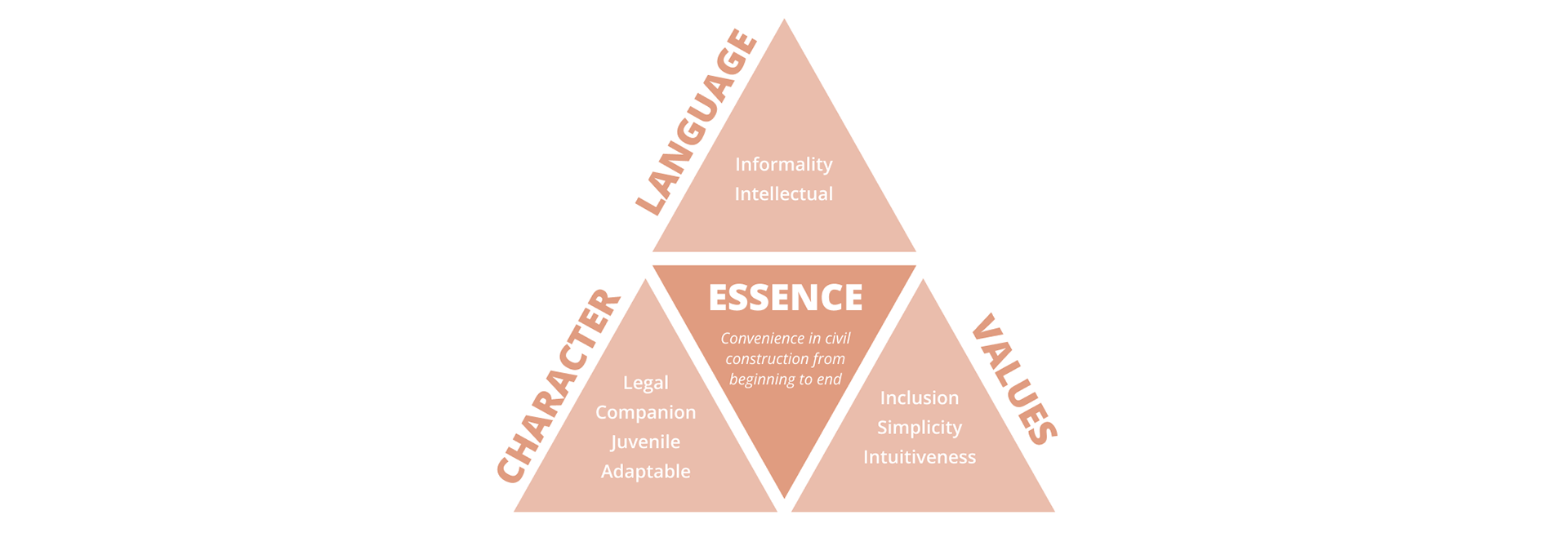
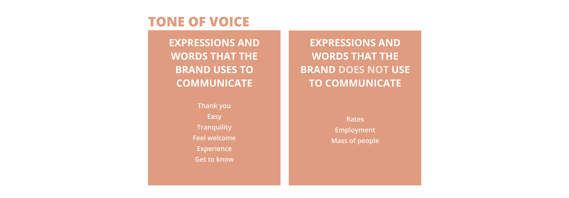
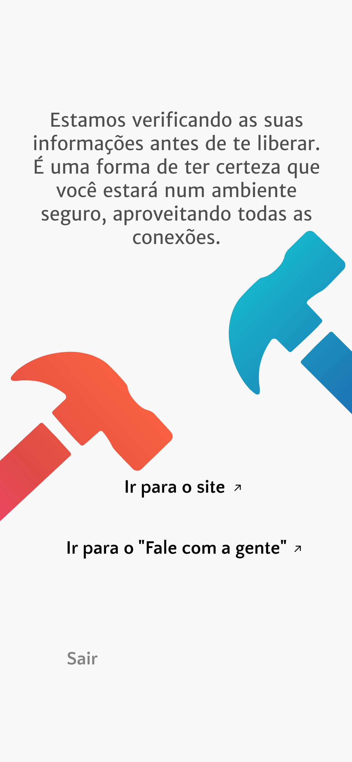
Concerned with digital inclusion and the debureaucratization of the search and hiring of construction professionals, the company proposes to be an inclusive, simple and intuitive platform. With an easy and relaxed language and simple usability with a few clicks, it aims at the interaction of users from different age groups and cultures who need to do some work, repair or maintenance, so that everyone feels welcome and well supported so that this process is no longer a headache and becomes something peaceful.
After the analysis of Jung's 12 archetypes, it was decided to select the Caring profile to best represent Kantan's personality. This personality reflects a great desire to help people by implementing solutions that he/she would also like to use, and fears that people around him/her go through difficult times, seeking solutions for their lives.
Thus, a pyramid was developed that allows the visualization of the company's identity and positioning, occupying the second item of Maslow's pyramid, security (employment, health and property).
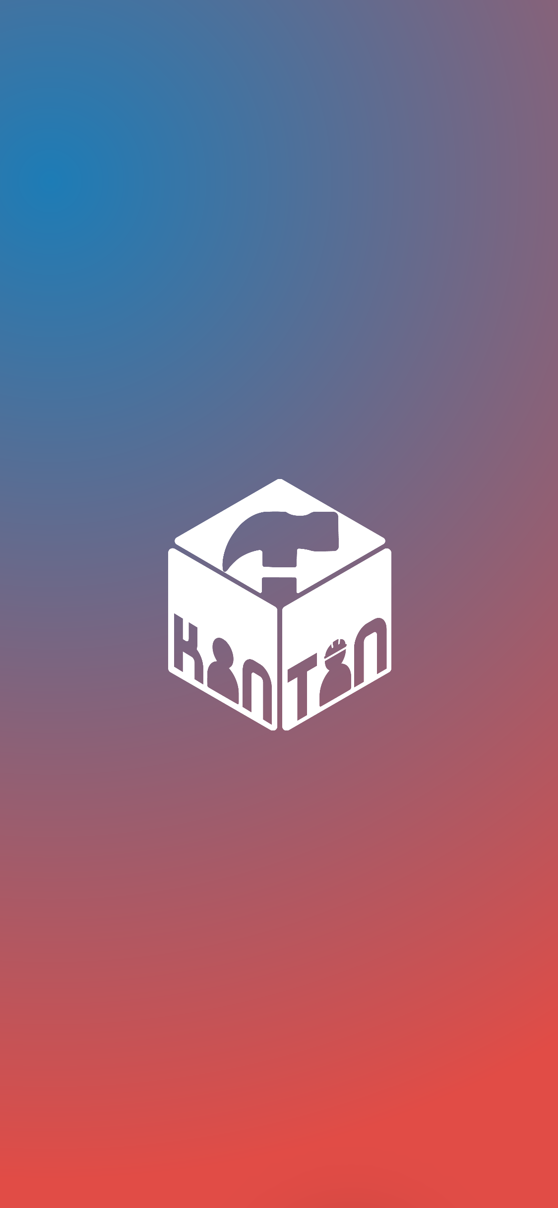
The name
The name Kantan has two meanings:
- The word originates from the Japanese language, and such language was chosen because of the Japanese discipline and commitment to work.
- It brings the meaning of "easy, uncomplicated and intuitive" and this is what will be perceived by the final user.
Thinking of showing this meaning in a visual way, the logo was designed:
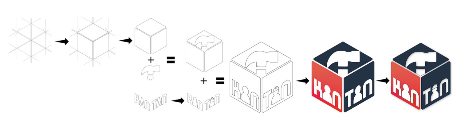
The logo features an orthogonal cube, in which three faces are visualized. The faces are the representation of the communication pillars established by Kantan: client-company-professional. Each face signifies a pillar and the painted color (red or blue) signifies the separation between client and professional.
Colors
The colors bring a variation of soft tones reminiscent of construction and a diverse scale for a more harmonious application.
The main color that represents Kantan is red (E14C46) graded between pastel and vibrant. The main colors were chosen from a triad from the main red tone and have a contrasting effect which is well used for having accessibility for people with color blindness, because of the contrast.
Spelling
The fonts used within the platform are part of a superfamily indicated by Google. They have modern fonts that speak to the audience, but also have serifed fonts for contrast.
It has a great variety of weights (more than fifty), because, thinking about the hierarchy of information, it gives flexibility to decide which information would have more or less weight and relevance in the interface for the user.
Based on: https://fonts.google.com/featured/Superfamilies.
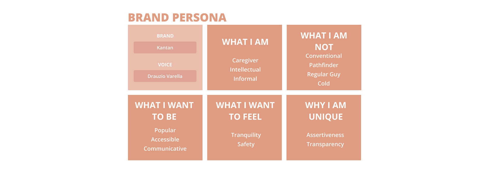
Brand persona
Wireframes
In Portuguese
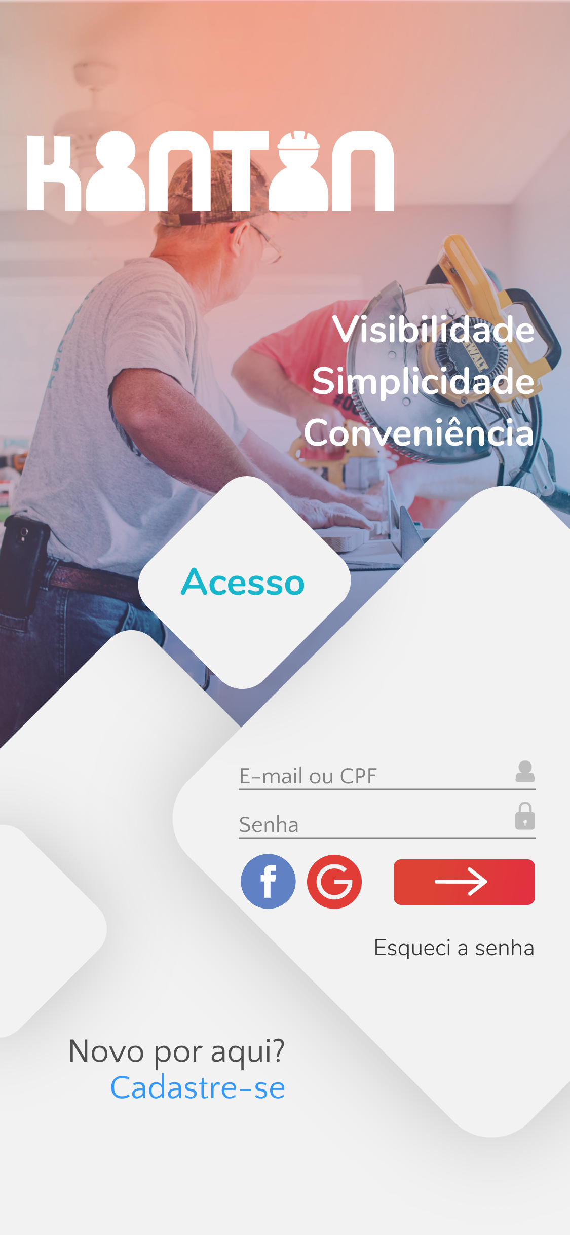

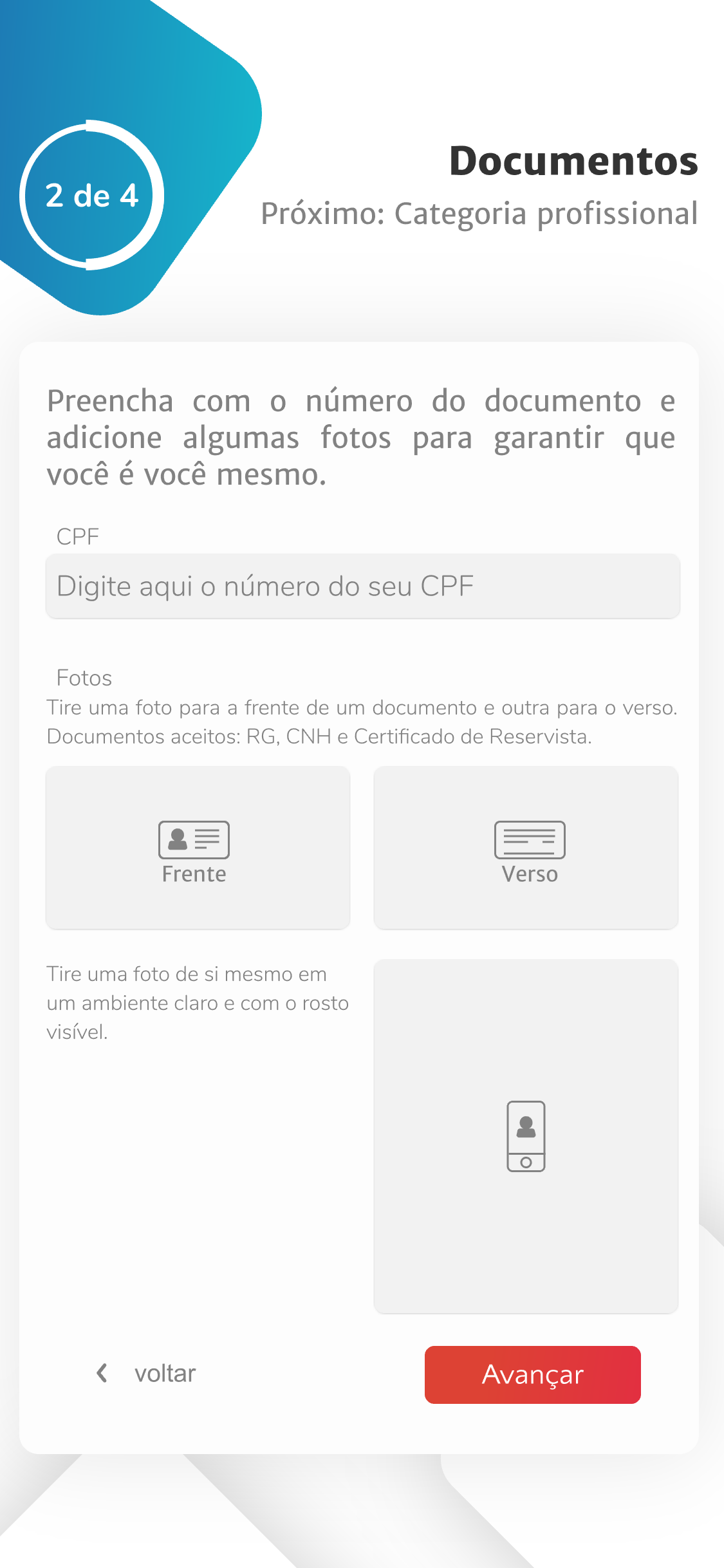
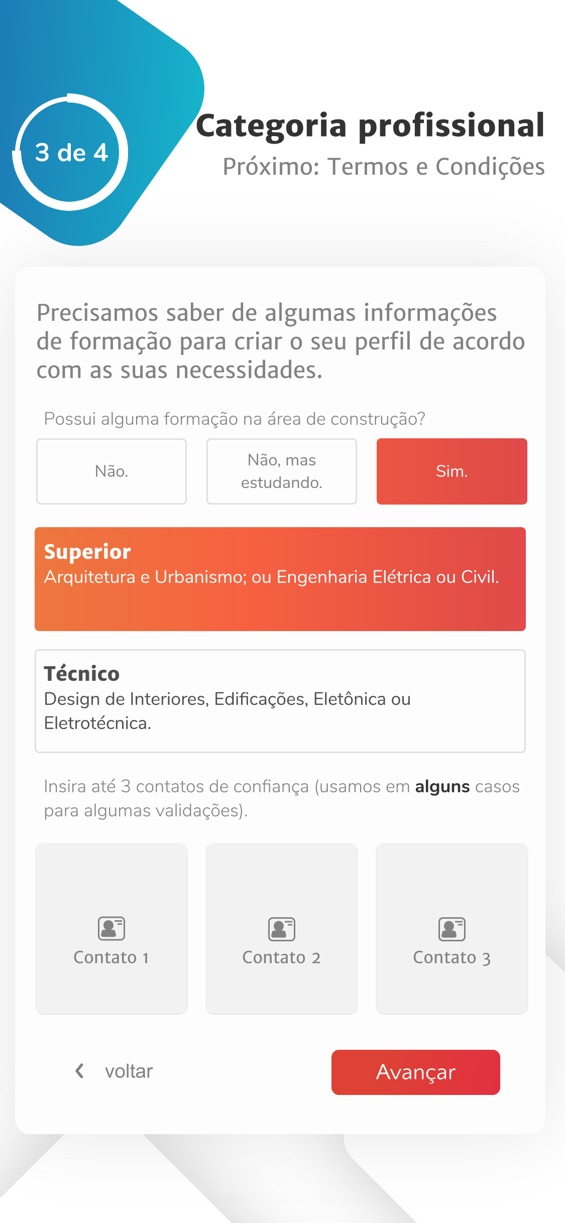
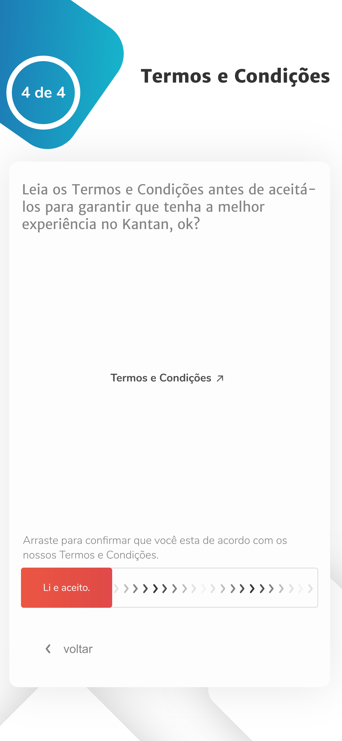
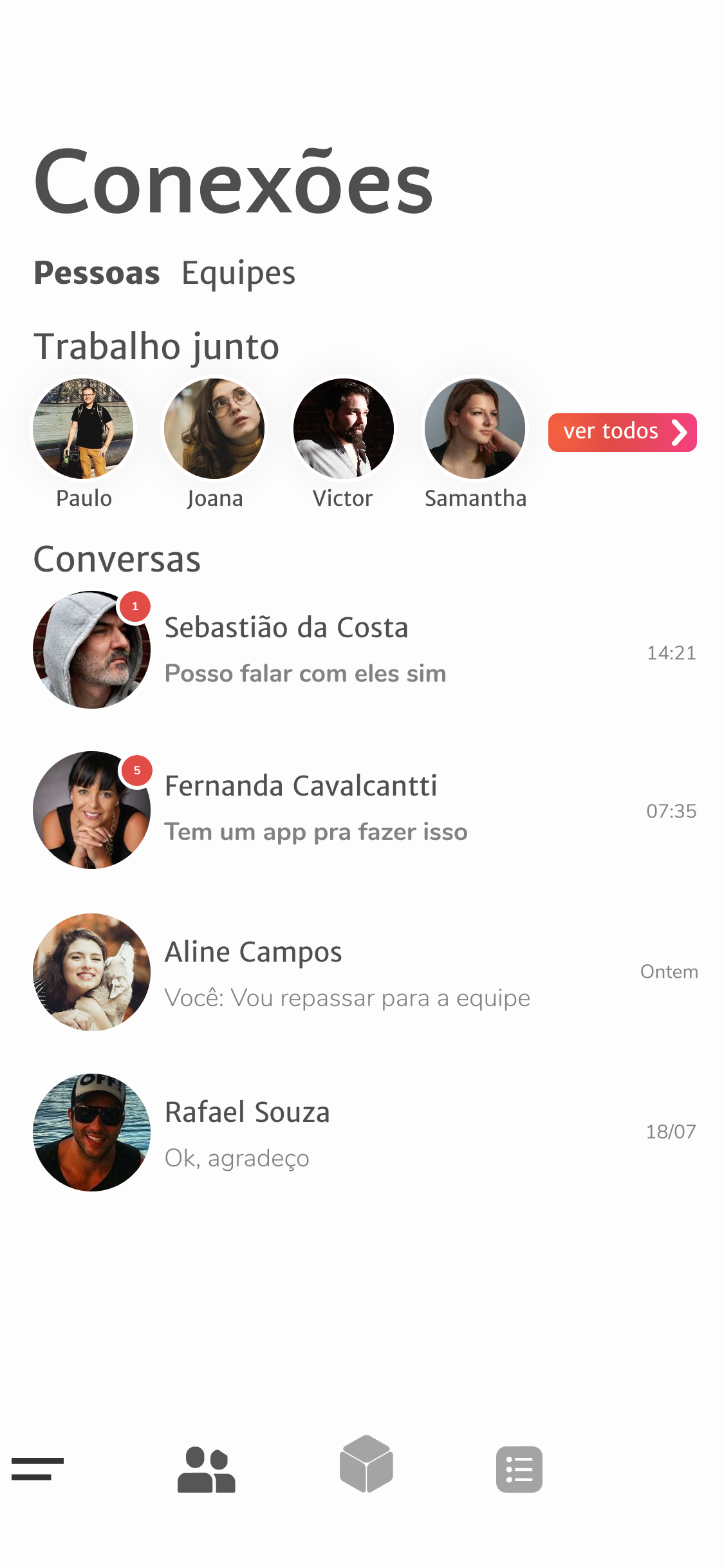
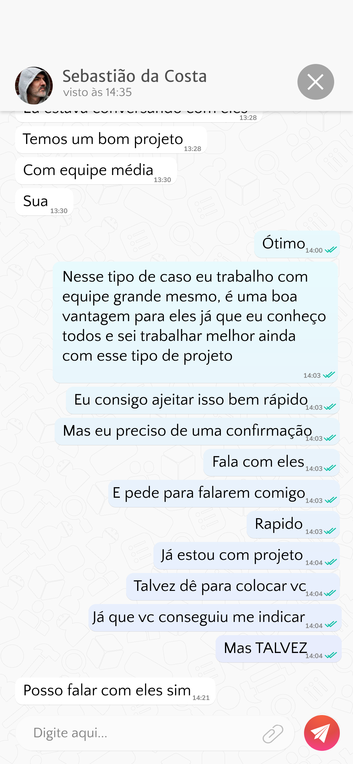
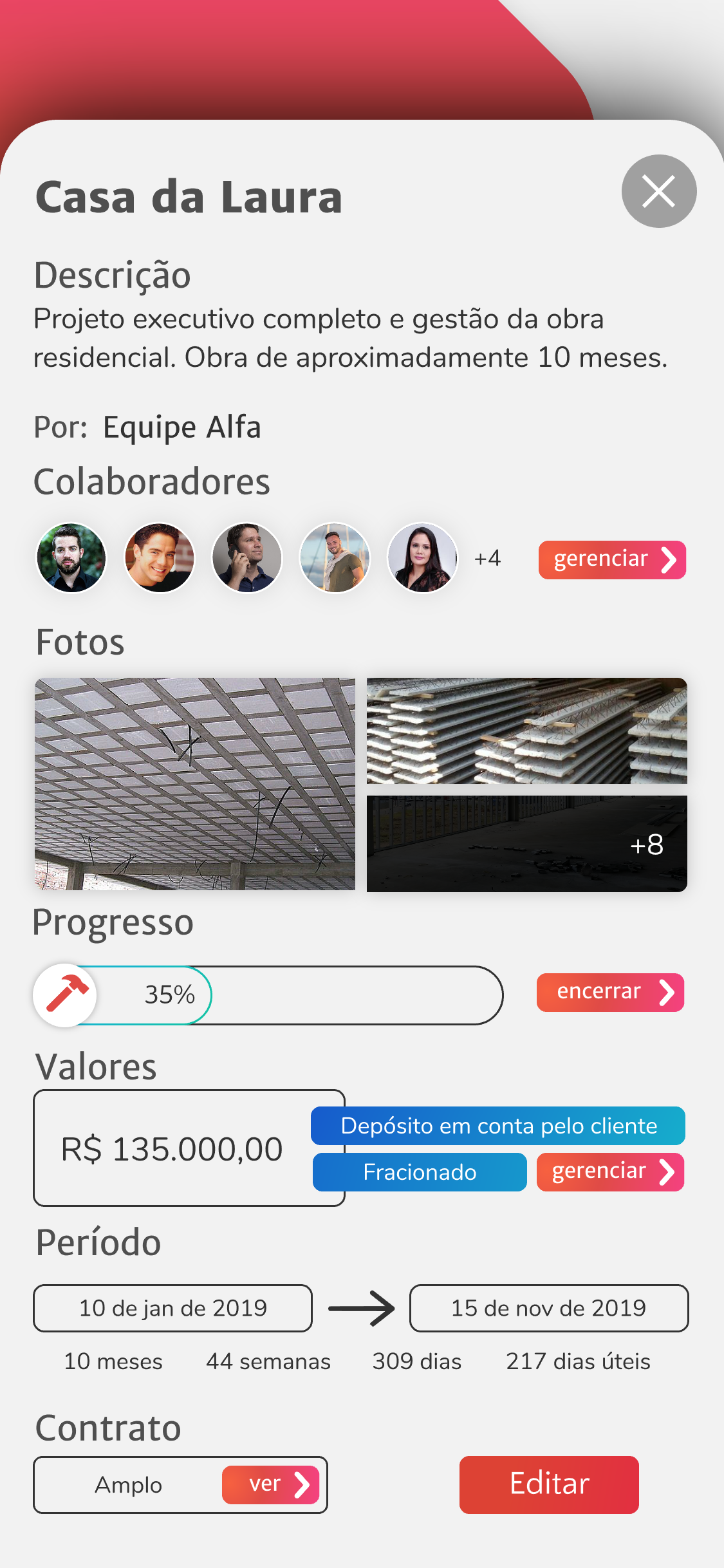
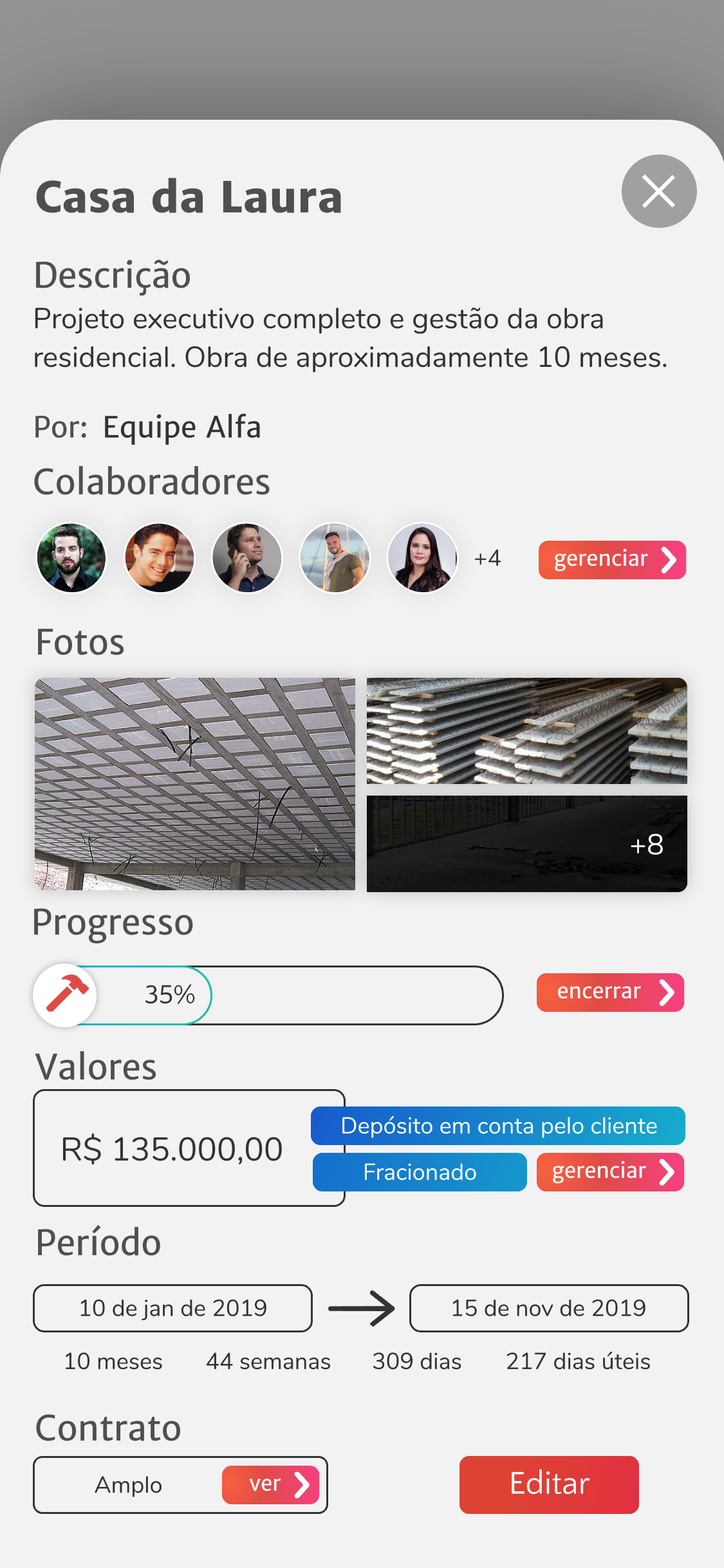


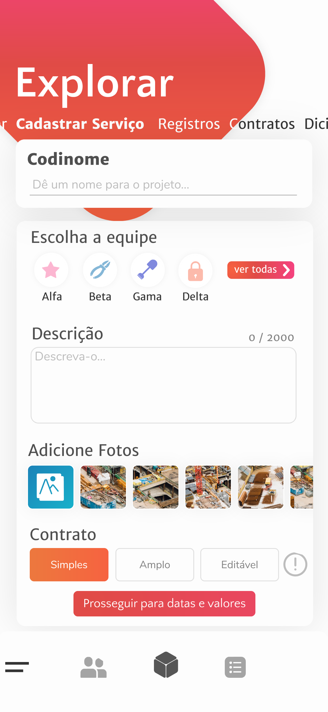
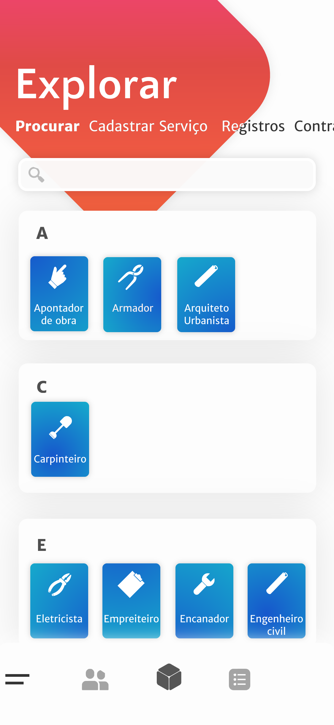
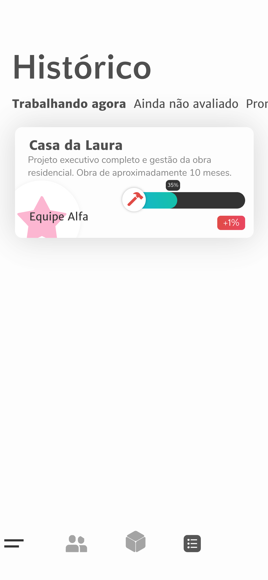
Mockups
In Portuguese